

Initial Claims Visualization
State variation of Unemployment Claims
There have been several interesting data visualizations regarding the Coronavirus. The economic impacts are beginning to emerge from published state/national macroeconomic data offering rich visualizations of Covid’s impact on the economy.
In this post, I explore the state variations in unemployment claims maintained by the US Department of Labor. I am using the most recently available data as of this publishing date.
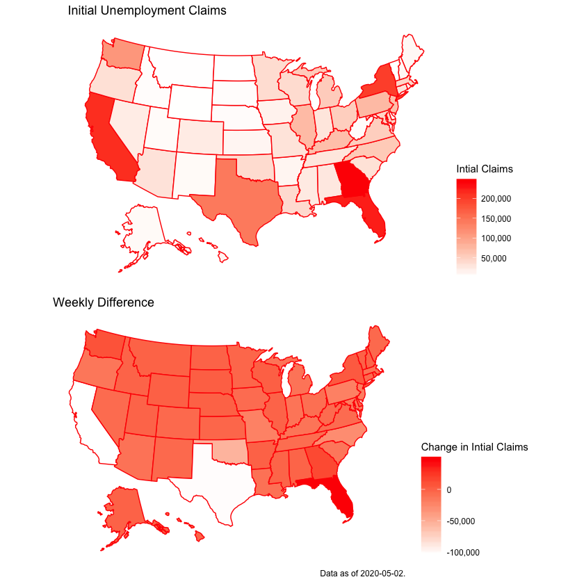
Initial Claims
The key metric in this post follows movements in the initial claims to unemployment insurance.
Specifically, an initial claim is filed by an unemployed individual after they are removed from a position by their employer. This is a leading economic indicator of labor market conditions, and provides a metric to track the flow of unemployment.
The plots below show the initial claims by state, and the week-over-week difference. There is obvious labor market distress in states like California, New York, Florida and Georgia given the initial claims plot, but when considering the change from last week, we see that California and Texas are experiencing a decrease in initial claims, whereas Florida’s labor market is more distressed.
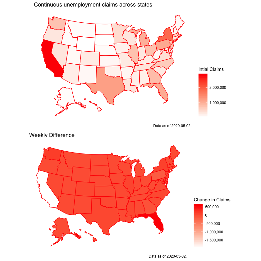
Continuous Claims
An additional measure to monitor is the continuous claims across states. Whereas the initial claims are the flow, the continuous claims are the stock. Specifically, when an unemployed person files an initial claim, he or she can file continuous claims in the subsequent weeks. The continuous claims are not considered leading indicators (predicting future activity), but rather correlate with the contemporaneous direction of the economy.
In the two figures below, we see a similar story as above. California is an obvious outlier in the size of workforce claiming unemployment insurance benefits, but the weekly difference suggests that this stock is decreasing by large amounts (over 1.5M in the past week). Likewise, Florida is the only obvious state experiencing an increase in their stock of continued claims.
Whats with the regional variation?
An obvious question arising from the data above is what is driving these variations? Are state labor markets contracting across all industries, or are specific sectors the source of layoffs? To provide a limited answer to this question, the Department of Labor also maintains a News Release that details the new levels and changes from previous weeks. Interestingly, the report aggregates some comments across the states that explain increases or decreases in the initial claims.
I take this PDF and extract the relevant comments related to these changes and match them to weekly change in initial claims figure from above to produce the corresponding graph:
This graph is the same as the second graph in this blog post and adds interaction capabilities, detailing the count of weekly change of initial claims, and most interestingly, the scrapped comments from the Department of Labor’s news release. A majority of states provided no comment this past week; however, states like Florida and Georgia did.
While Florida’s comment regarded layoffs in a variety of sectors, Georgia’s comment mentioned cuts to health care and social assistance works…two sectors one would prefer to not see layoffs during a pandemic…
Conclusion
Covid-19 has obviously affected states differently, and we are starting to see the economic impacts of the virus and the ensuing policies. California seems to have been hit hard in terms of unemployment insurance claims, but this effect seems to be dissipating. Florida and Georgia’s data provide ominous conditions to their respective labor markets.
Note: For data, code and figure replication, please reference my Jupyter notebook on my Github page.